Audubon

Meet Mary
Mary is a bird watcher. It may not be your thing, but it’s a pretty popular hobby around the world. Mary is member of a large bird watching community that counts more than 40.000 members in US alone. These guys spend their weekends strolling through nature in hopes of spotting a rare and, while Mary can't quite find the right words to explain the thrill of it all, it's just exciting. A good birder is a good listener with a sharp eye. It’s no wonder, then, that when she goes on her birdwatching walks, Mary usually brings a pair of binoculars. Lately, though, she's been using a new tool. Audubon.
Mary's community
Audubon is an app on Mary’s phone, we know that much, but whose idea was it to build the app in the first place? You see, for people who share Mary’s passion for nature and birdwatching, birds are no joke. The National Audubon Society is a US based non-profit organisation using science, advocacy and education to protect birds and preserve their habitat. One might say they are the birds’ biggest allies on the continent.
Okay, now about the app
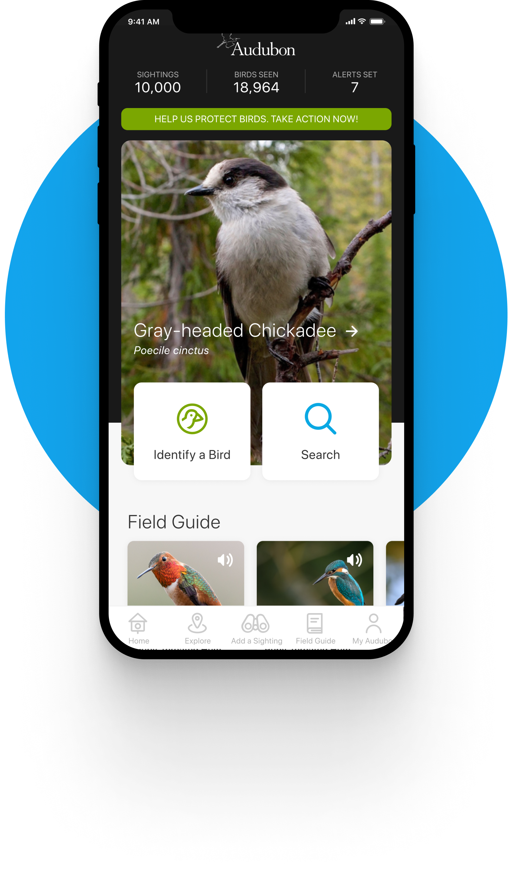
A dedicated birder has to have a series of intangible talents. Patience and serenity. A good ear and a pair of sharp eyes. Most importantly though, a good birder has to have a thirst for knowledge that's hard to satisfy. The Audubon app helps Mary identify unknown species and learn about them. When Mary is on one of her walks and spots a bird she doesn’t recognize, using Audubon’s Field guide, she can describe the bird she saw and figure out the name of the species and learn all about it. The world's most extensive bird guide includes over 3,000 photos, more than 8 hours of audio content, multi-season range maps and in-depth texts by leading North American bird expert Kenn Kaufman.
What was wrong with Audubon
Mary loves Audubon for of all the premium content the app holds, but we like to think it’s not just about that. Pixion was tasked to have the entire app redesigned and built from the ground up using a new UI system. Audubon never lacked knowledge or passion, however, before we stepped in, they did have major issues regarding UI inconsistencies and dead ends within the user journey. Aside from a lot of good will and noble ideas, the app seemed outdated, messy, complicated and confusing.

Making Audubon great again
At Pixion, we build and improve digital products. A lot of times, our tasks are primarily tech related, but in Audubon’s case, we were primarily tasked with doing a thorough redesign of the app. After a detailed analysis of the existing setup, we decided to make the app entirely about Mary. Well, maybe not Mary specifically, but we did decide to have every process within the app revolve around the user. Audubon has a very unique and specific use - when Mary is out in the wild and spots a bird she wants to know more about, she doesn’t have a lot of time to muck about. More often than not, there is not room for error, so we had to make the app extremely intuitive. All the content, quite literally, had to be at Mary’s fingertips.
How did we do it
In order to make the app about Mary, we had to become Mary. Well… Either that or, at the very least, understand her the best that we could. The first step of every design project we do at Pixion is to gather as much relevant knowledge as possible. That’s why we became birders for a while. Apart from understanding the user, we had to understand the client as well. So we included them in every part of the process, doing remote workshops on a weekly basis. Not one design or architecture element within Audubon is there because it is simply pretty. Everything was thought through, discussed and tested. We used Figma as our main design tool, generating ideas, drawing first sketches and wireframes. After the concept phase, we moved towards creating prototypes, testing and integration.
Results
Our partnership with Audubon lasted for almost two years. After the initial redesign, we continued to polish the app, expanding on the initial setup and adding new features. During our partnership, Pixion turned Audubon into a beautiful, award-winning product. The results? Well, Audubon’s downloads and donations grew considerably, but maybe it’s best we let the users do the talking: “Incredibly useful for bird ID and seeing what birds have been sighted in my area. Major props to the Audubon team for the constant improvements. All the issues I’ve had in the past seem fixed! Very impressed with the climate extension. Way to go, Audubon!”